Source: Abner Li / 9to5Google
Google Chat, the company’s Slack and Microsoft Teams competitor, looks to be getting an overhaul in the near future that features a new logo and “Timeline”-focused redesign of the mobile apps.
At the moment, the Google Chat icon is green and features overlapping conversation bubbles. The color is an homage to its Hangouts origins, but Google is set to change that.
Earlier this month at the Workspace Summit, the company showed off a four-color icon when talking about Google Chat. Google tells us today that this was a “conceptual look at the future of Google Chat” and that it “will have more to share soon.”
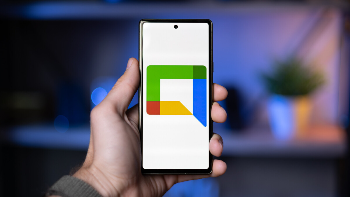
The new Google Chat logo is the outline of a chat bubble with a sharp drop-off. In fact, there are two bubbles in the icon: the colorful perimeter and one formed by the white internal space. It very much fits in with Google Meet. For a better look, we recreated it in our cover image above.

Also of note on the slide is “Timeline,” which appears to show a redesign of the Google Chat mobile app. Today, you have a bottom bar with two tabs for Chat and Spaces. A “Chat” is either a 1:1 or group conversation, while “Spaces” are analogous to Slack channels in that they’re larger and usually open to big teams.
This could be the app’s new main screen, with top tabs leveraged. “Timeline” shows all conversations you’re part of — Chats and Spaces — with the ability to sort by All, Unread, Pinned, DMs, and Spaces.
The next tab over might show where you’re directly mentioned. This approach could be a better way to get a glance at all the conversations you’re a part of. Better management could be one appeal of Google Chat over Slack or Teams.


Source: Abner Li / 9to5Google
